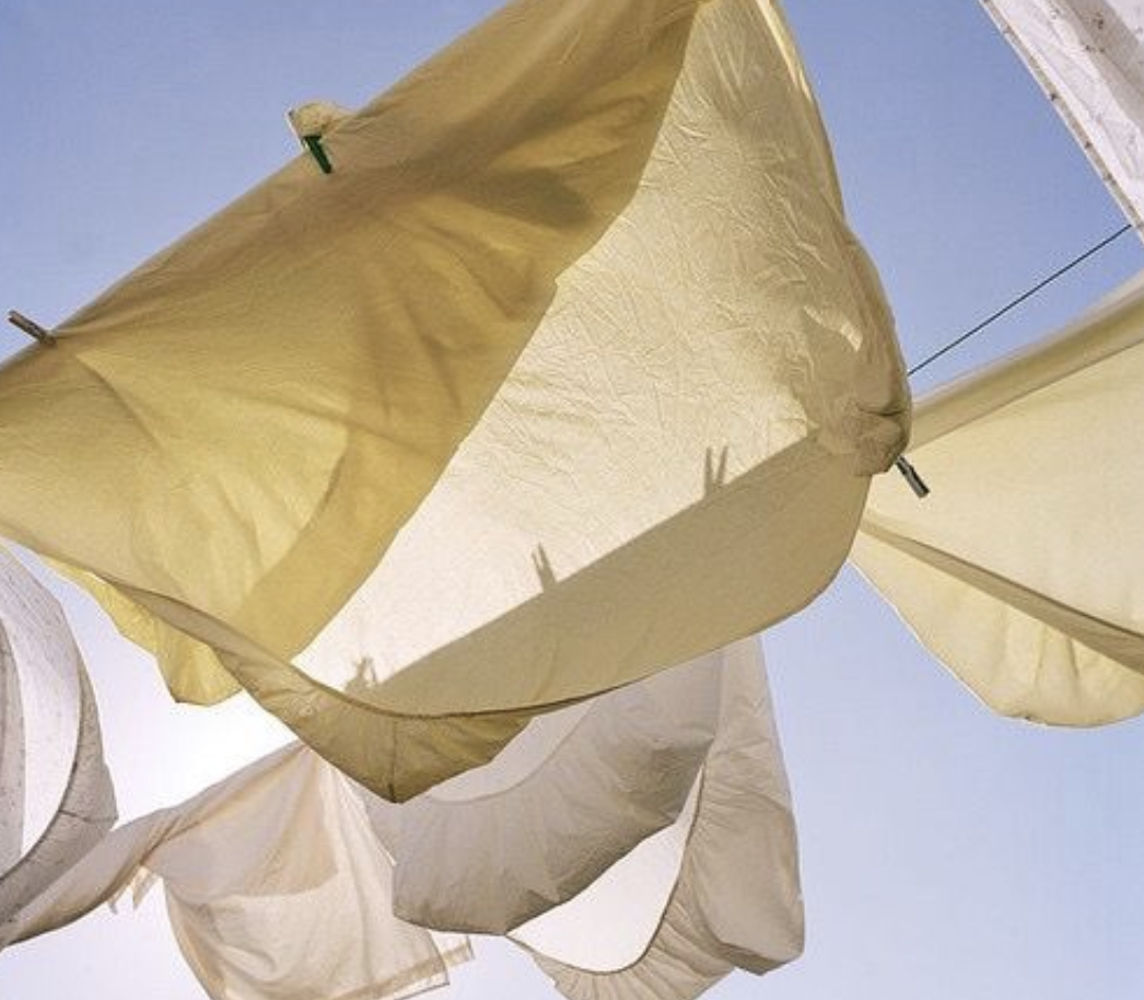
COLORS OF SUMMER
Summer color stories can start to feel predictable–the usual rhythm of bright blues, beach whites, neon pops.
Around here we crave something more true to our being, so we reach for palettes that really breathe.
Tones that are nuanced, layered, and rooted in the more energized moods of the season.
Easy Neutrals
We begin with the colors of grain: sandstone, oat, wheat.
These soft, sun-tinged neutrals glow under changing light. Never overpowering, always grounding. There’s a kind of stillness to them, like slow motion.
2. Muted Botanicals
It’s hard to miss with tones of greens.
Sage, thyme, eucalyptus—not the crisp greens of Spring, but the lived-in kind, the ones that grow in dappled corners and forgotten garden beds.
They carry a subtle sense of refresh, perfect for interiors that need a little lift to breathe a little deeper.
3. Accents of Honey & Amber
To add warmth without tipping into Autumn we reach for golden hues.
Honey, amber, ochres… the natural fibers of materials such as rattan & bamboo. These shades feel sun-soaked and inviting, like the last golden hour before dusk sets in.
4. Weathered Terracotta
It feels like there’s an inherent romance to terracotta, the way it carries memory, age, the slow passing of time.
Found in accent walls, ceramics, & soft textiles alike, these tones makes a space feel worn just enough to feel like a home.
5. Mist & Smoke
Misty grey, cool smoke, whispery dust tones that balance the heat.
Stone, linen, hand-thrown ceramics all bring a sense of quiet breath between the warmer notes.
The key is always restraint. Summer doesn’t have to be loud to be felt.
Sometimes the most powerful palettes are the ones that ask you to look a little closer… to feel the Earth beneath it all.
We design for feeling, letting the senses guide us.


