

“She stood by the tea-table in a light-coloured muslin gown, which had a good deal of pink about it. She looked as if she was not attending to the conversation, but solely busy with the tea-cups, among which her round ivory hands moved with pretty, noiseless, daintiness.”
― Elizabeth Gaskell, North and South
Pink: rarely asked for by our clients, however when it is we secretly smile with delight as it is a color we love the results of. Especially for a few little girls bedrooms we have done and a vintage bath comes to mind.
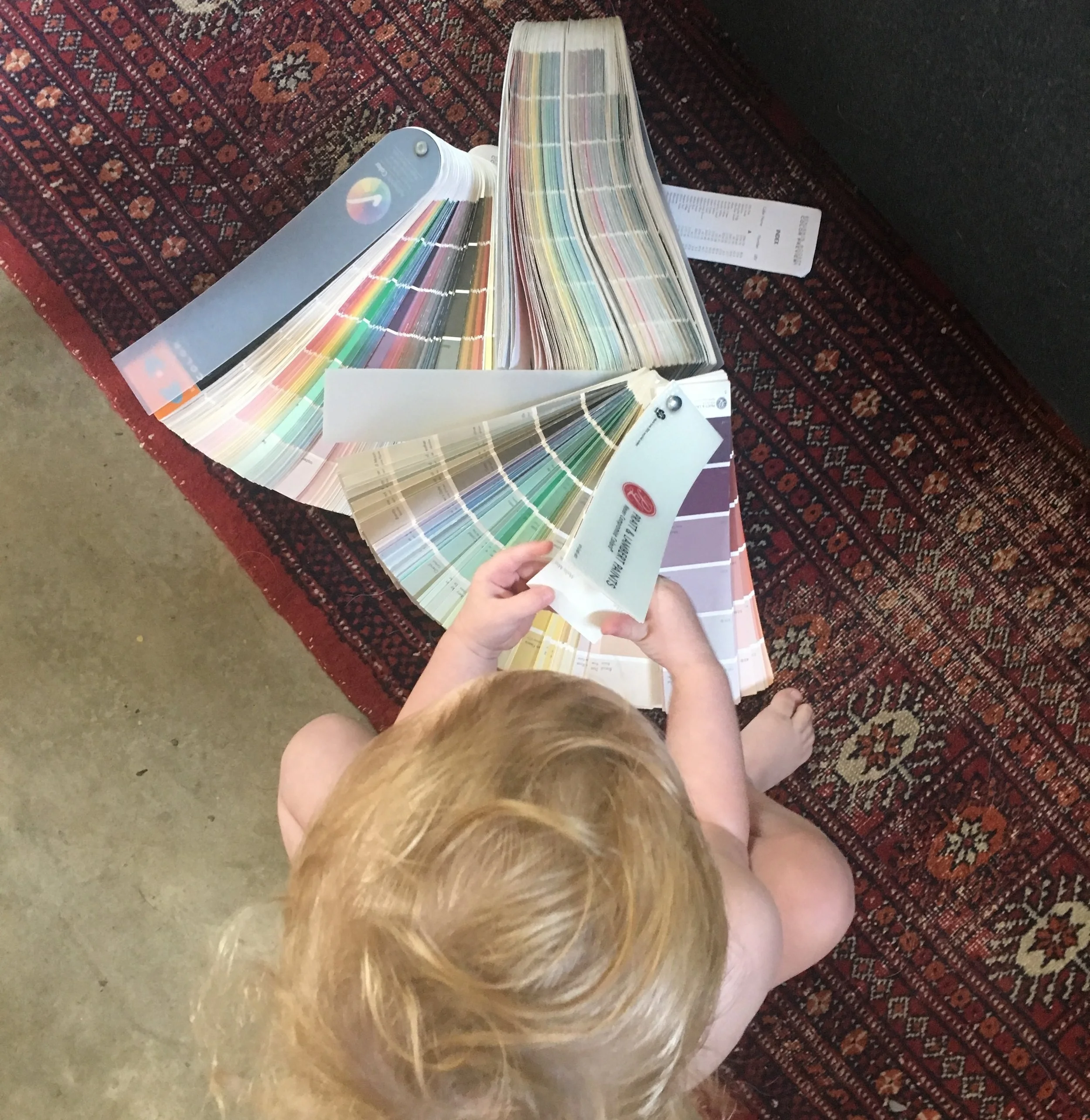
PLEASE NOTE: Using a computer to choose paint colors can be misleading. The color displayed on your screen is an inaccurate representation of the actual paint color. Always go grab a sample or a color swatch!


Above: Slip by Benjamin Moore (AF-605) is a good option for introducing violet undertones without appearing to child-like or sugary-sweet. While this image does show it on the walls in a child's playroom, we love to use it is adult bedrooms. Pairs beautifully with deep, moody greys and linen fabrics.


Above: Lavender Mist by Benjamin Moore (2070-60) is another favorite. It reads as black in shade and as a beautiful deep forest green in brighter light. Part of their Historical Collection.
Below: Spring Purple by Benjamin Moore (2070-40) may be chosen for a combination of blacks with a distinctly navy tone. We envision them used on trim and body for a uniform result.


Below: Lilac Tan (19-06) by Pratt & Lambert complements warm browns tones and has a nice presence without being too "bubblegum". Presents well on exteriors for historic homes. Here it is paired with a creamy white and acts as a delightful backdrop for the front yard, full of the homeowner's thriving rose garden.


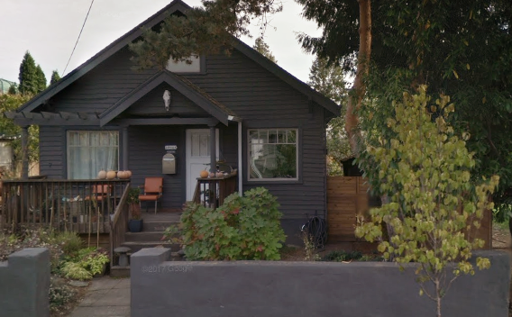
Below: Angel Food (10-68) by Pratt & Lambert is a color we find soft and inviting. Here it is used on the front door and ceiling as a modern pop of minimal color against this deep grey home. The home owners, originally had a white front door, but wanted a subtle color change to celebrate the birth of their daughter.

Below: Ballerina Pink (2082-70) by Benjamin Moore. This color is nuanced. When applied in a historically influenced interior next to a creamy high gloss trim our clients were over-the-moon thrilled with the results. We paired it with a watercolor wallpaper mural of roses for an incredibly refined look that will easily transition from childhood to teen years.

